

— Team
✦ Mahmoud Galal
✦ Ayla Kekhia
Duration/ 3 Days, 15 Hours
Product/ IOS App
Bootcamp/ Ironhack
Client/ KFC

— Challenge
The brief of the class as a part of Ironhack UX/UI Bootcamp was to choose an app to enhance the UI of the app using Figma while keeping the same UX as a challenge and do a heuristics analysis of the app and make it look better. So, Of course we went for the famous & Delicious KFC because obviously we’re hungry!
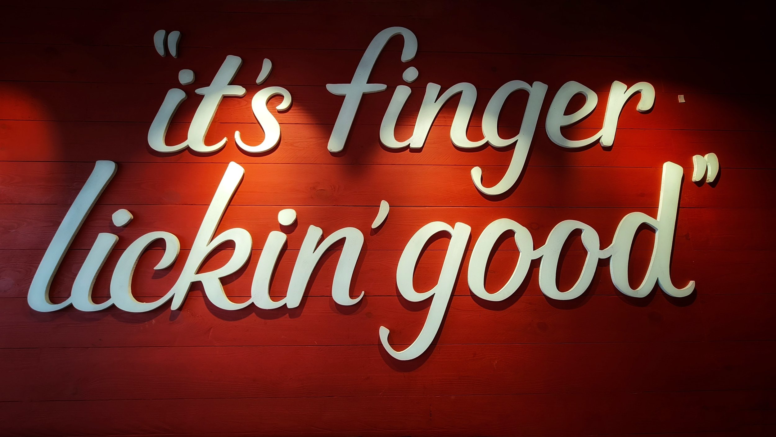
KFC (Kentucky Fried Chicken) is an American fast food restaurant chain headquartered in Louisville, Kentucky, that specializes in fried chicken. It is the world's second-largest restaurant chain (as measured by sales) after McDonald's, with 22,621 locations globally in 150 countries as of December 2019.
KFC was founded by Colonel Harland Sanders (1890–1980), an entrepreneur who began selling fried chicken from his roadside restaurant in Corbin, Kentucky, during the Great Depression. Sanders identified the potential of the restaurant franchising concept and the first "Kentucky Fried Chicken" franchise opened in Utah in 1952.
— Heuristics Analysis
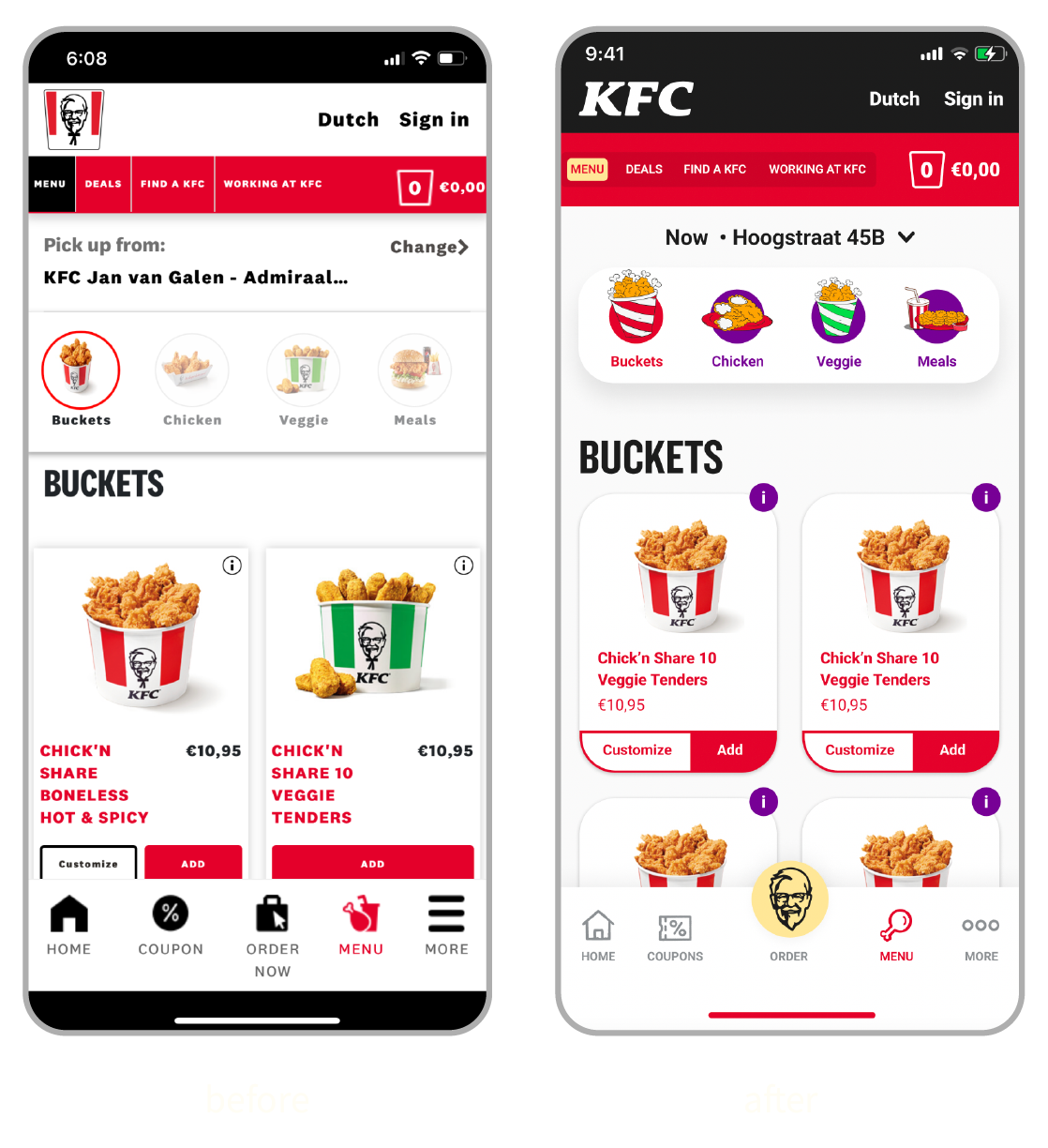
First we started with studying the app and taking a deep look into it and do a heuristics analysis and analyze the atomic design and inventories of the app and we decided to go for 6 specific screenshots to redesign.
Findings/
✦ The app design had a lot of inconsistency across pages
✦ The alignment and the overall professional look of the app was not good and inconsistent
✦ It didn’t really match the new current rebranding of KFC
✦ Shadows were overused and not realistic
✦ Design was not minimal at all and had a lot of complex designs which could be simplified to look more beautiful


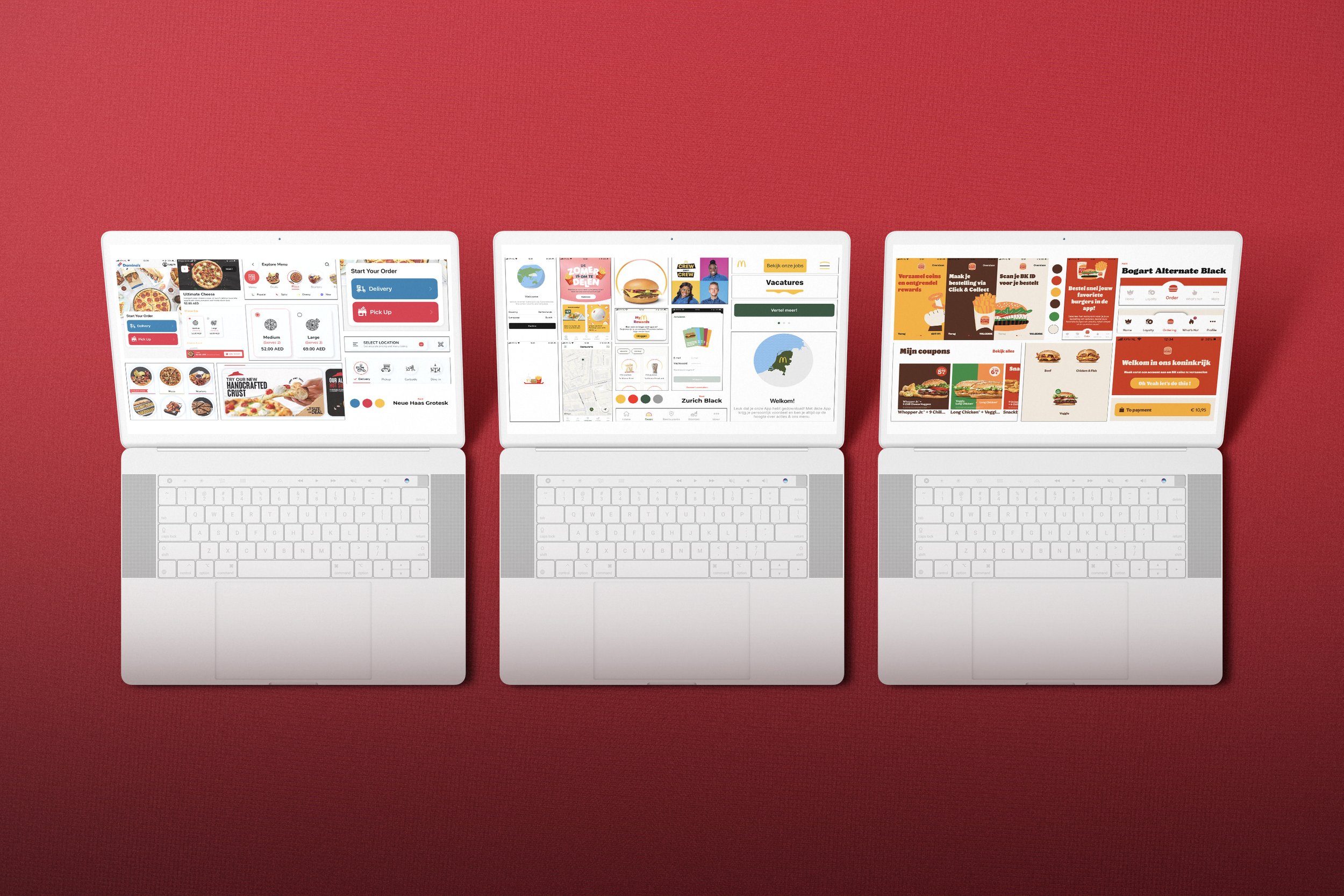
— Competition
Then after a deep analysis of the app we jumped right into the First step of the UI redesigning conducting a visual competitive analysis of the main competitors that have an online ordering app like Mcdonalds, Burger King & Domino’s Pizza.
The moodboard was more of a collective of the vintage KFC posters along with the posters of the current rebranding of KFC while injecting the little grungy side of the vintage KFC.
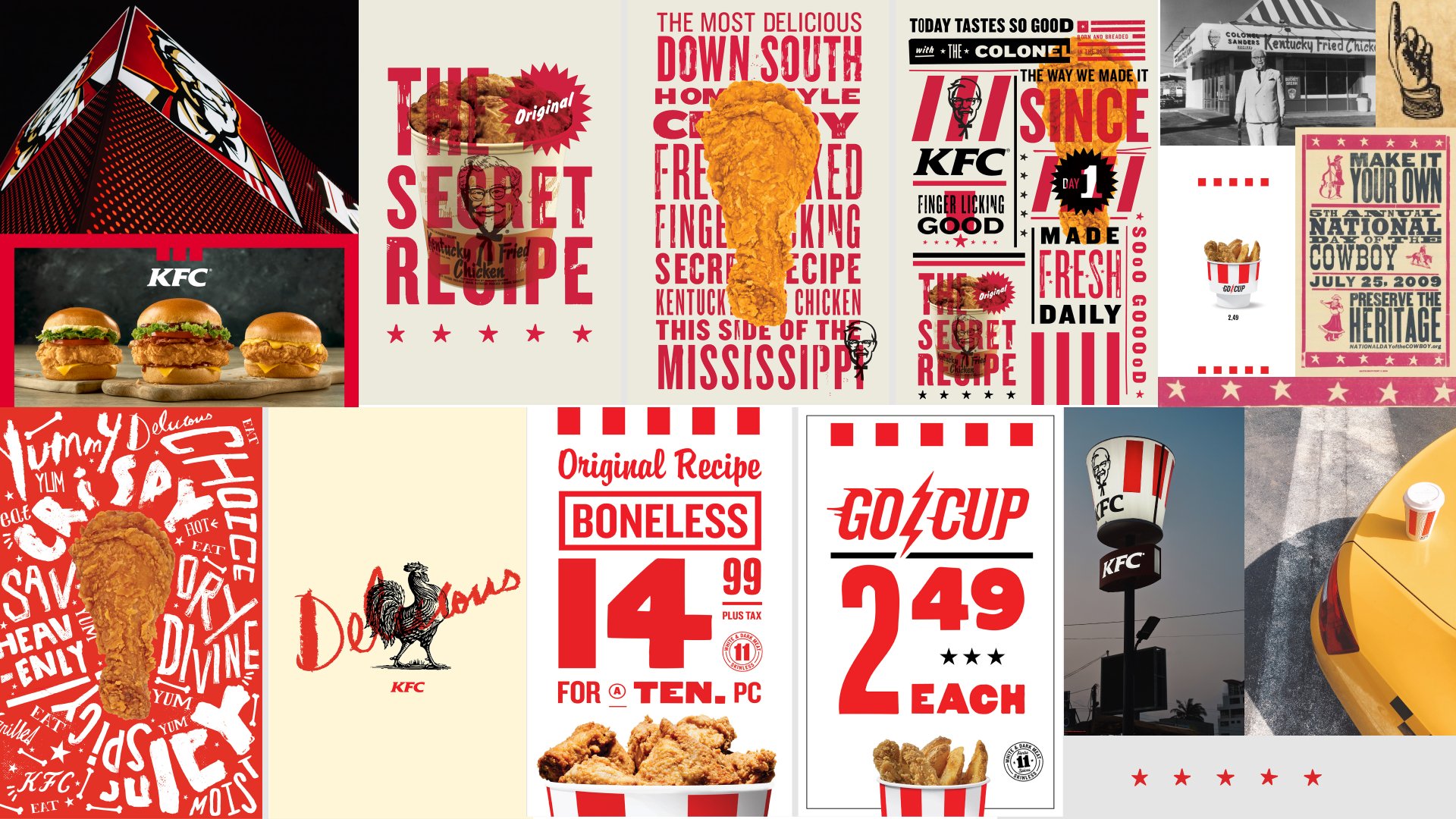
— Moodboard

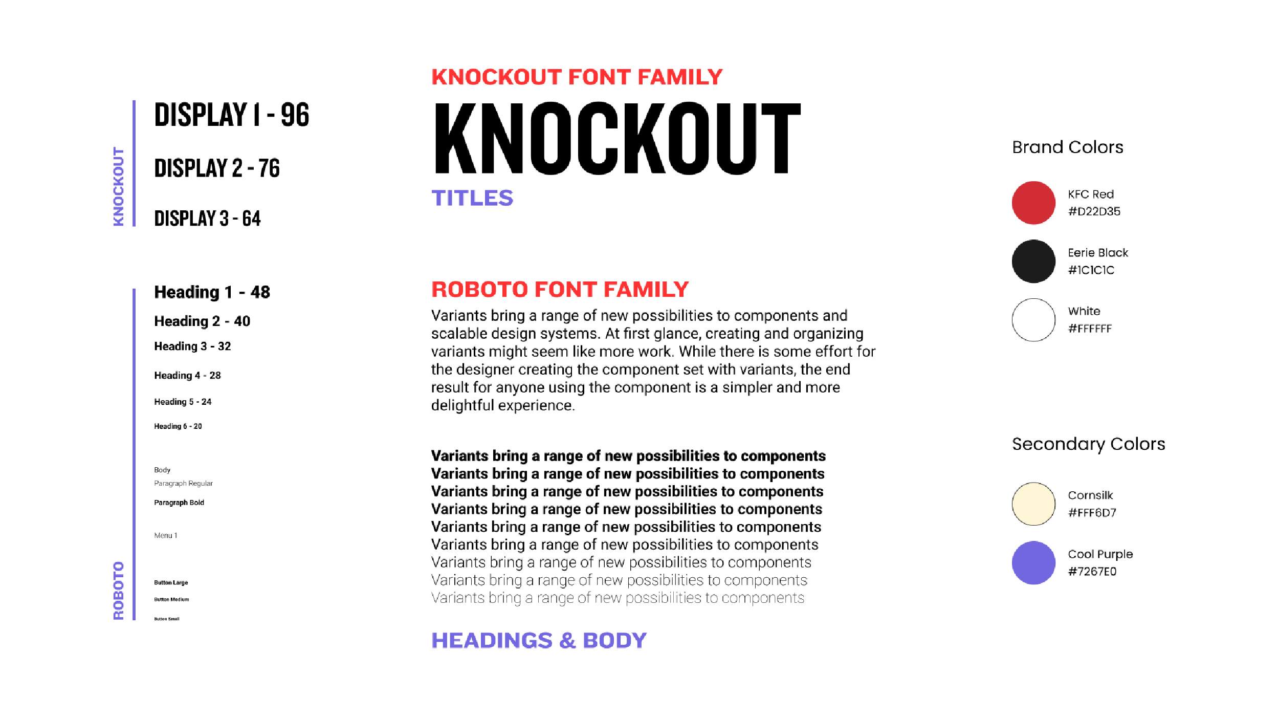
— Style Tile
Then we finished our style tile which consists of our typography and brand colors where we decided to for the official font of KFC new rebranding to make it look relevant and consistent with other platforms and choosing Roboto Typeface for the headings and paragraph that matches our main font then for the colors we of course used the KFC red but toned it down just a little bit to make easy to see on the app for our users and added two accent colors which is the pale yellow one from the vintage KFC Posters and the new rebranding too, we also added the pale purple as accent color which looks really nice contrast-wise with other colors and at the same time it is a completely different color from our competitors which differentiates KFC.
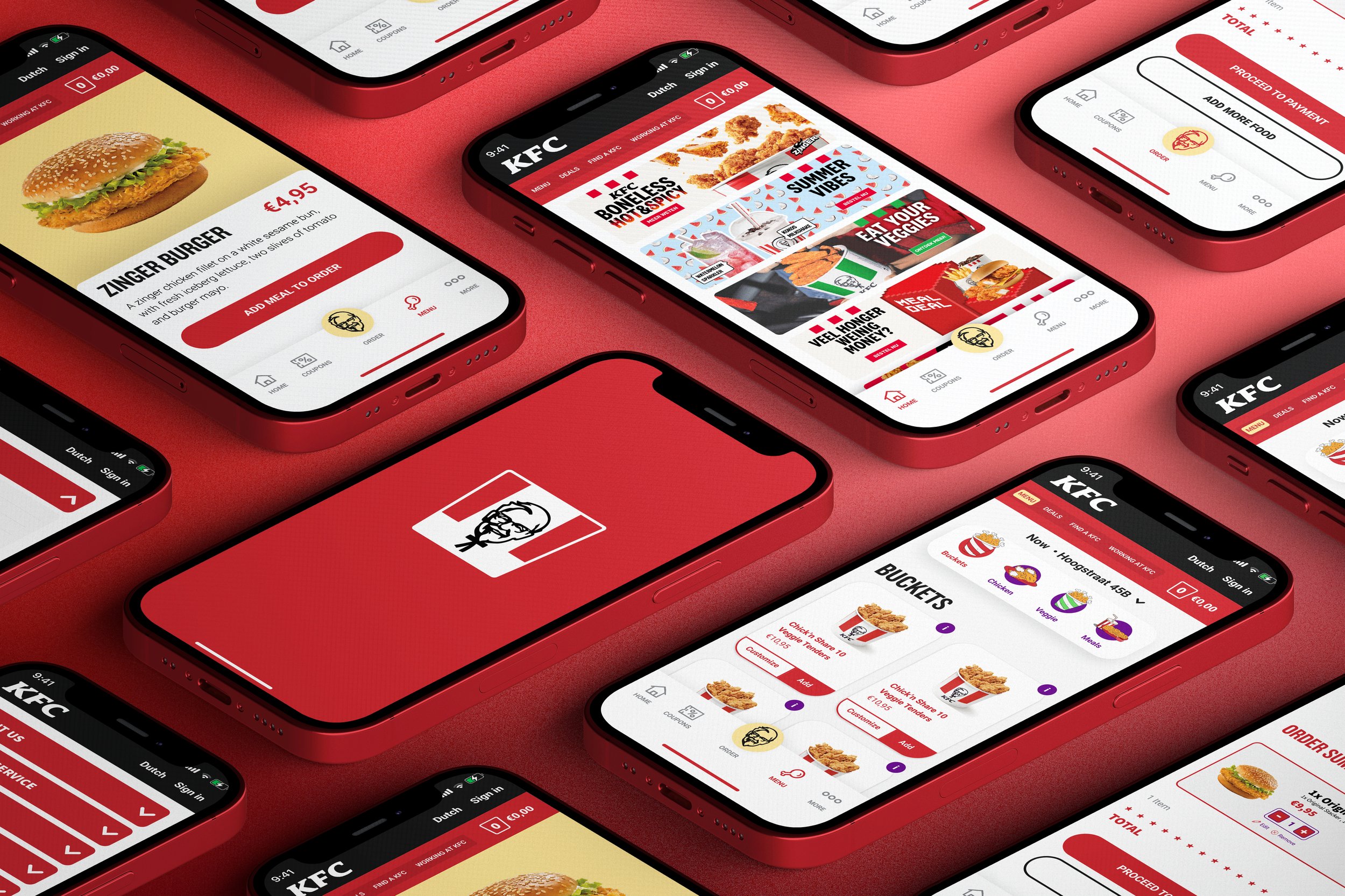
— KFC, Redesigned
Finally it was time to redesign our app. Mainly we redesigned a lot of aspects of the UI to make it more modern and user friendly while making it relevant to the new rebranding.
Splash Screen/ Redesigned the splash screen with a little animation to make it more satisfying to the user.
Menu Page/ Redesigned the menu page to make it more simple and modern and also injecting fun illustrations for the menu sections with a cool satisfying animation when you press a section.
Homepage/ Completely redesigned the homepage with a modern and sleek approach with a more engaging navigation bar with the KFC Icon as a button in the middle to be intriguing for users to make an order and also adding the icons in a grungy style that matches the KFC Vintage trendy style.
Product Page/ The Product page now looks easy to the eye and the Product title and ingredients are well organized with a big part for the burger picture to make users hungrier.
Checkout Page/ The checkout is now more compact & modern in an efficient layout and we also injected the stars from KFC new rebranding.
Information Page/ This page was so hard to navigate into and hard to read so we decided to for a smart accordion which was a good approach for a lot of clickable information like this and at the same time it is an engaging approach for users.


— Order Now!
Now it is time to experience the actual app! Try not to be hungry though.
Splash Screen
Homepage & Browsing the Menu
Adding a product to the basket & Checkout
Browsing Information in the Accordion

— Learnings
Atomic Design Methodology/ Working on this project with an atomic design model in mind was really fun and made me realize how important the atomic design is and applying it to each stage of creating the components was extremely beneficial.
The Challenge to keep the UX/ Working on this project with the restriction of keeping the same UX was challenging in a nice way, it opened my eyes on how to improve a good UI while keeping the same UX and at the same time made me instantly point out what could be improved in a bad UX.